Meta Ads
The Lead-Gen Landing Page Checklist (What Converts Paid Traffic Into Enquiries)
Your ads buy the visit; the page decides everything after. The block-by-block anatomy of a lead page that converts — message match, proof, form design, and the friction worth keeping.

PPC & Creative Strategist
Half the "ad problems" I audit are page problems wearing an ad costume. The campaign buys a qualified visit for ₱12, the visitor lands on the homepage, scrolls past four unrelated services, can't find a phone number, and leaves. Then the ad account gets blamed.
A lead-gen landing page has one job: turn a specific promise (the ad) into a specific action (the enquiry) for a specific person. Here's the block-by-block checklist I build against, whether I'm writing the page or auditing one.
TL;DR
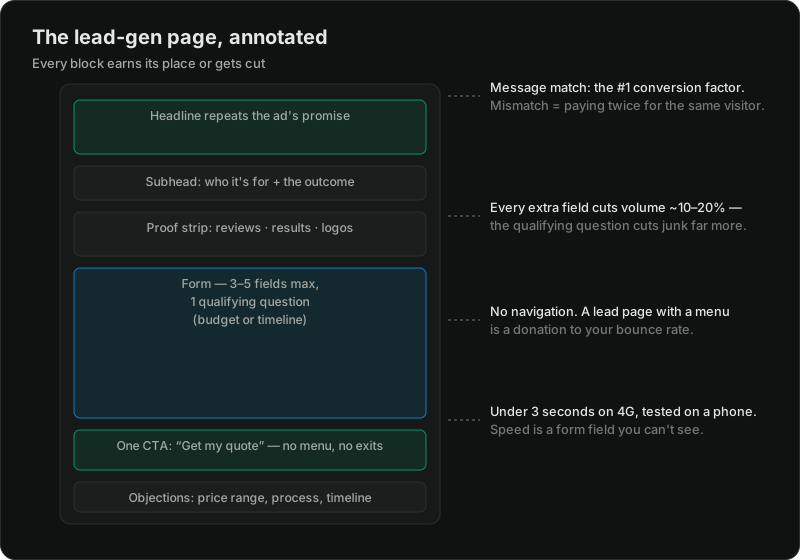
Block 1: The headline — repeat the promise
The visitor clicked an ad that said something specific. The first line of the page must say it back. Ad: "Fixed-price kitchen renovation quotes in 48 hours" → headline: "Your fixed-price kitchen quote, within 48 hours." Not "Welcome to Cruz Construction," not a clever slogan.
This is the single highest-leverage element on the page, and it's why one page per campaign theme beats one page for everything. If you run five ad angles into one generic page, four of them break their promise on arrival.
Block 2: The subhead — who this is for, and the outcome
One sentence qualifying the reader and naming the result: "For Metro Manila homeowners renovating kitchens ₱300K and up." Yes, that sentence costs you clicks from the wrong people — after they've already been paid for, which is exactly when you want them to leave quickly rather than fill your form with junk. Qualification here is lead quality insurance; the downstream math is in getting leads but no clients.
Block 3: Proof, early
Before asking for anything, show why you're safe to contact: review scores with sources, client logos, specific results, credentials, photos of real work and real people. Specific beats grand — "214 kitchens completed since 2018" outperforms "the trusted leader in renovation." One strong proof strip above the fold, deeper proof (testimonials, case snippets) further down for scrollers.
Block 4: The form — friction is a dial, not a sin
Block 5: Objections, answered on the page
Price range ("projects from ₱X"), process ("what happens after I enquire"), timeline, service area, "will I be pressured?" — every unanswered objection becomes either a lost lead or a wasted call. An FAQ block near the form is the cheapest sales assistant you'll ever hire.
Block 6: The exits you delete
No navigation menu. No footer link farm. No social icons walking your paid visitor to Facebook. A logo that doesn't link home. The only clickable things: the CTA, the phone number, and legally required policy links. Every extra exit is a paid click donated back to the internet.
The invisible blocks: speed and mobile
Test the page on an actual phone over mobile data. Over ~3 seconds to usable and you're paying full price for traffic that never sees your headline. Compress the hero image, drop the chat widget that loads 2MB of JavaScript, and check that the form is thumb-typeable — field size, no zoom-jumping, numeric keypad for phone fields. Most PH paid traffic is mobile; the desktop version of your page is the minority experience.
And measure it: form submissions as the conversion event (a thank-you page makes this clean), call clicks tracked, events verified before the campaign scales. The page can be perfect and still invisible to optimization if tracking lies — see why the platform numbers don't match.
The test that finds your page's weak block
Watch three people (not employees) open the page on their phones, cold. Ask: what is being offered? What would happen if you filled the form? What made you hesitate? The hesitations map one-to-one onto the blocks above — fix the block they point at first, not the one you enjoy redesigning.
Related reading:

Written by
Vince Servidad
PPC & Creative Strategist
I manage Google Ads and Meta Ads for ecommerce, healthcare, SaaS, events and nonprofits, with creative strategy, Shopify development and conversion tracking.